

How to create animated multicolour border on element
Hi, I'm Marco, Engineering Manager and a Lead developer with experience building and managing product-focused teams. My tasks include handling the engineering team delivering on time and with quality code, helping them grow in their role and guiding them towards their career goals. As a developer, I work extensively with JavaScript front and back (Vue, React and node) and other modern technologies (SCSS, GraphQL, NoSQL DBs, CD/CI, unit and e2e testing, development experience, etc.).Mentoring and teaching developers to grow and learn is a big part of my job and personal mission. Furthermore, I like seeking new technologies and staying up-to-date on industry trends and advancements. In addition to my roles as a front-end and engineering manager, I have often served as a Scrum Master, helping companies introduce an agile methodology or improve the existing one.
Here is a quick example of how you can create an animated multi-colour border effect for your element using CSS only
- Creating the project structure
mkdir animated-border

cd animated-border

touch index.html

touch style.css
let's start with a basic html markup. Infact, we only need a empty div with a class for targetting it with CSS
<!-- index.html -->
<!DOCTYPE html>
<html lang="en">
  <head>
    <meta charset="UTF-8" />
    <meta name="viewport" content="width=device-width, initial-scale=1.0" />
    <meta http-equiv="X-UA-Compatible" content="ie=edge" />
    <link rel="stylesheet" href="./style.css" />
    <title>Rotating coloured border</title>
  </head>
  <body>
    <div class="box"></div>
  </body>
</html>
let's now style the body. It is not necessary but will add more impact to the final effect
/* style.css */
body {
  width: 100vw;
  height: 100vh;
  background-color: #111;
  display: flex;
  justify-content: center;
  align-items: center;
}
now let's style the div thagt we called .box
/* style.css */
.box {
  width: 400px;
  height: 250px;
  background-image: linear-gradient(
    40deg,
    #0000ff,
    #00ffff,
    #ff0000,
    #ff0099,
    #ffffff,
    #00ffff,
    #ffff33,
    #00ff33,
    #ff0099
  );
  background-size: 200%;
  display: flex;
  justify-content: center;
  align-items: center;
}
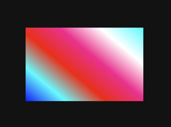
the result vary based on the colours you're gonna chose, but it should look like something like this:
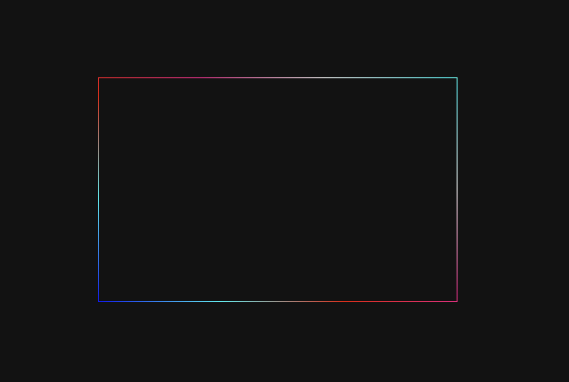
Now we'll cover the unecessary color for giving the border effect. for doing that we are using the pseudo element "before". If you want to learn more about pseudo elements, please refer to pseudo-elements
/* style.css */
.box&:before {
  content: '';
  width: calc(100% - 2px);
  height: calc(100% - 2px);
  background-color: #111;
}
and this should be the result now
One last step missing. If we want to make the border move, we have to animate it using keyframes.
/* style.css */
@keyframes flashy {
  0% {
    background-position: 0 0;
  }
  33% {
    background-position: 500% 0;
  }
  66% {
    background-position: 0 0;
  }
  100% {
    background-position: 500% 0;
  }
}

/* and use this animation on the .box element */

.box {
  /* ... */
  animation: flashy 10s linear infinite;
}
Here you can find the final code and the video for this example: